Wonderhouse Alecto – they even purveyed intercontinentally displaced knees!

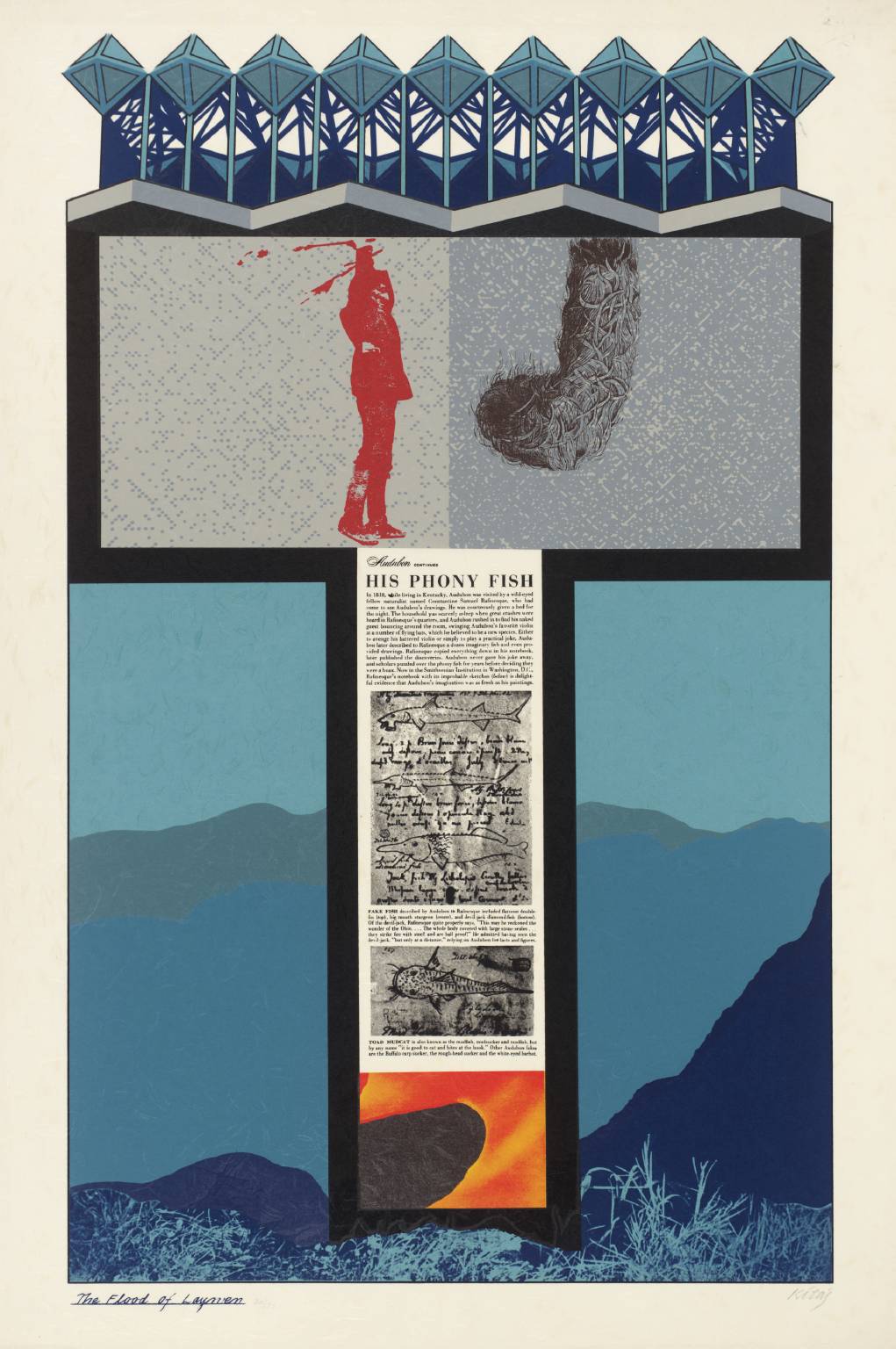
At the centre of the 60s prints scene in London was Editions Alecto. Originating in Cambridge when Paul Cornwall Jones and Michael Deakin commissioned John Piper and Julian Trevelyan to create lithographs of the University’s colleges for sale to a ‘captive market’ of their alumni. In 1962 the operation relocated to Chiswick as a limited company. The following year an exhibiting facility was opened at the Print Centre, Holland Street, Kensington and in 1964 Editions Alecto’s address became 27 Kelso Place, Kensington. In 1966 it established a New York showroom and a gallery in Albemarle Street in Central London.

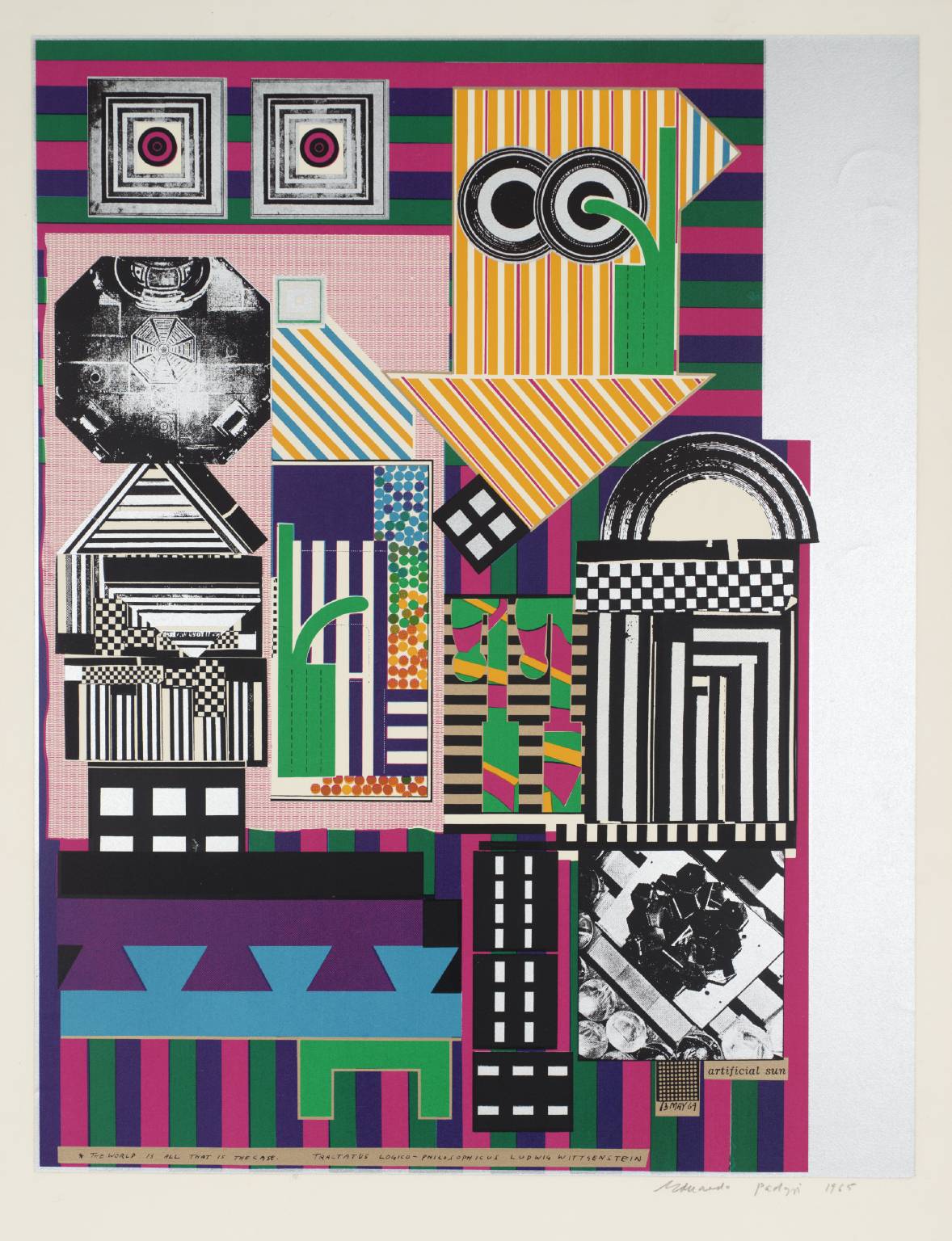
EA galvanised a growing number of artists to work in the print media and championed the concept of affordable art by means of editioning – including 3D objects, as produced by Richard Smith – as well as prints on paper.

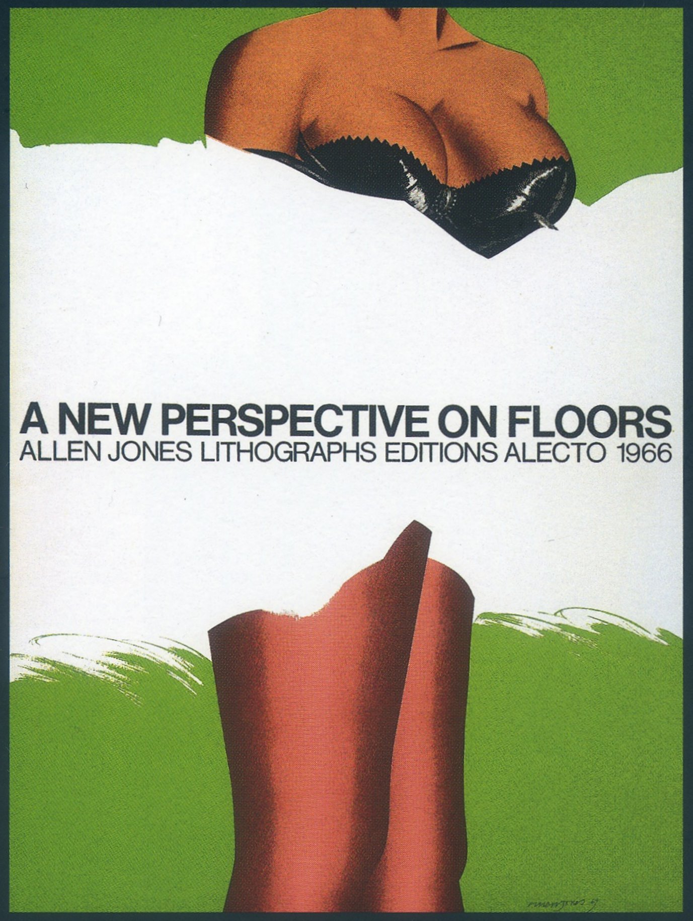
Here is an ad run in Studio International in 1966:

SI Ad Collage

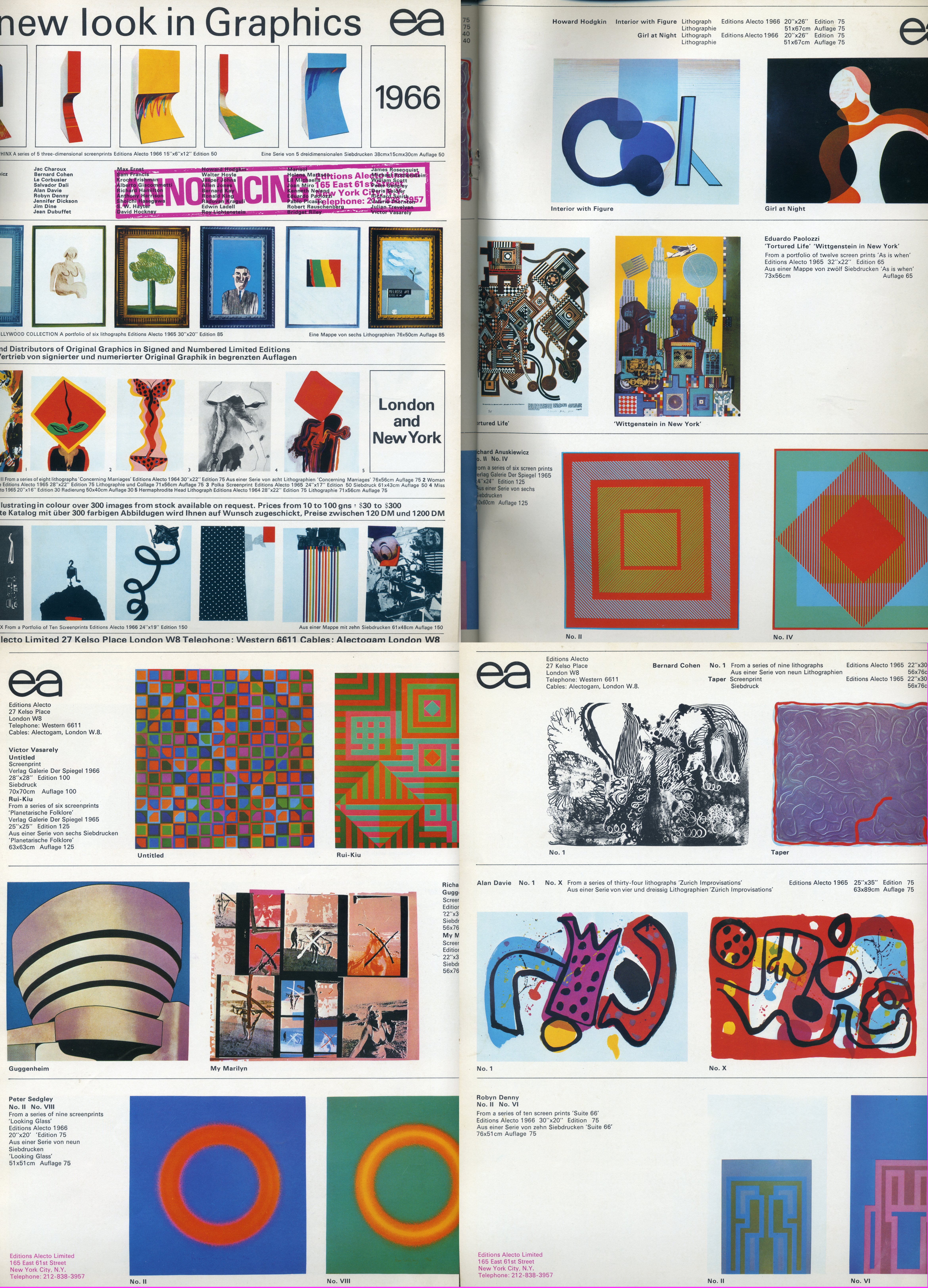
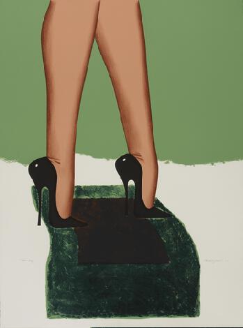
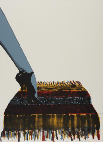
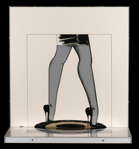
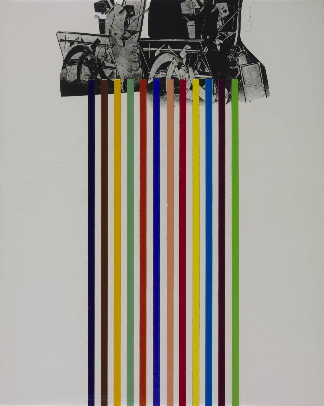
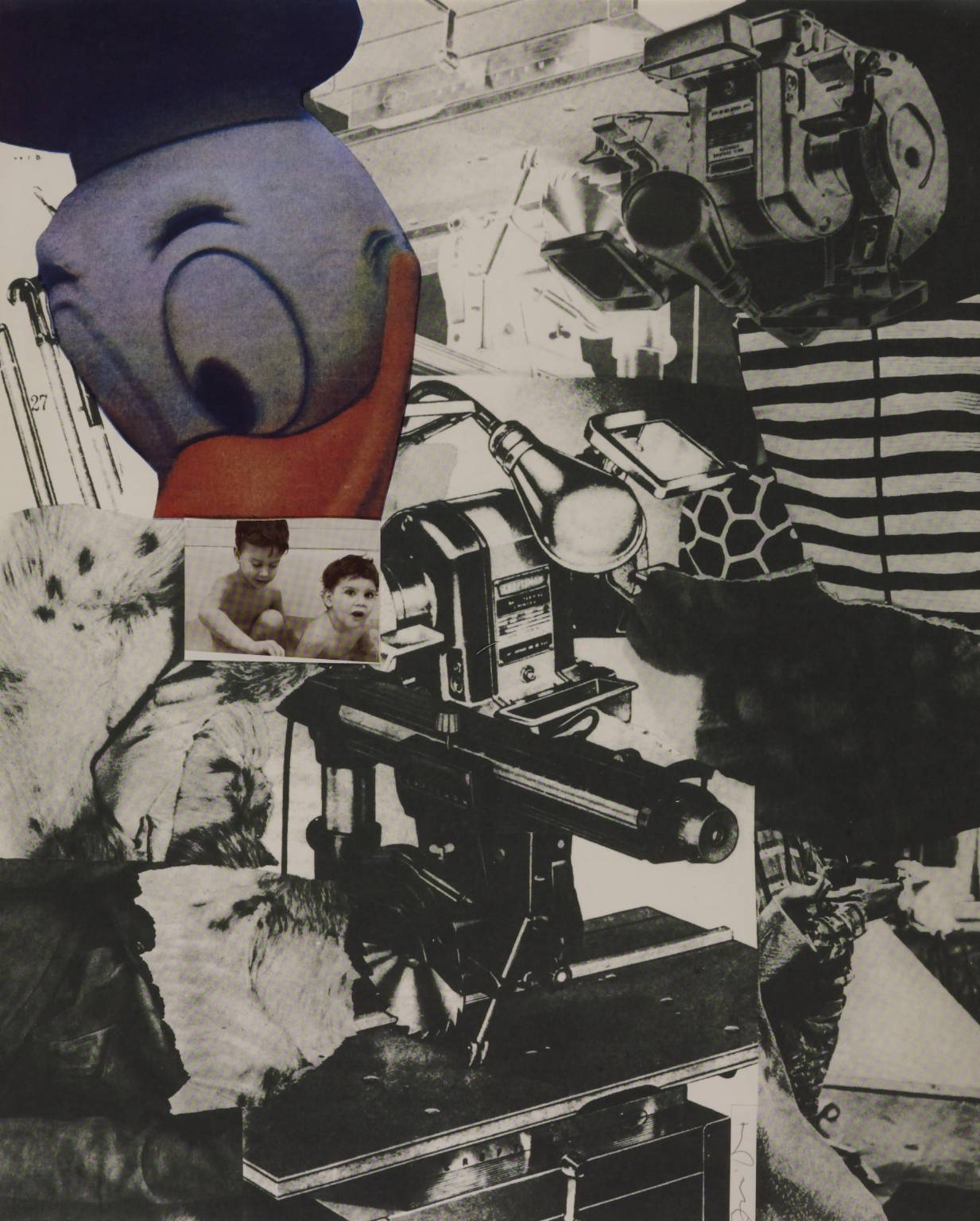
Although EA was very ‘British-trendy’, in tune with the London music and fashion scenes, it had a truly international impact, attracting American artists like Claus Oldenburg (with his London Knees) and Jim Dine, with his Tool Box (1966) – two examples from that suite below:

Tool Box 10 1966 by Jim Dine born 1935

Tool Box 6 1966 by Jim Dine born 1935

A catalogue of the EA output is embodied in Tessa Sidey’s book, Editions Alecto – Lund Humphries – 2003 – ISBN 0 85331 877 8.  Also well worth consulting is Decade of Printmaking – edited by Charles Spencer – Academy Editions – 1973.

A Single Echo

Jones made another lithograph in similar style, The Lesson, in 1967. Printed by Mathieu in Zurich and published by Editions Alecto it was produced in an edition of 50:

The Lesson

One of the visual devices that was frequently explored in 60s art was the tiled (to indicate perspective) horizontal ‘surface’ as a fragment rather than as part of an integrated overall image representing a visual reality; for example in Peter Phillips 1968 screenprint, Christmas Eve:

4. Christmas Eve 1968 by Peter Phillips born 1939

This device provided a ready means by which the viewer could be engaged in a looking/thinking process testing the perception of the work as a flat surface/existential object versus the representation on it of a ‘picture’ imported from the outside world. The Lesson sums this up so well, visually and in its text:

Realism is simply the immediate comprehension of a set of pictorial conventions that, through perpetual use, have become familiar to everyone. This over-experience, has blunted out our sensativity (sic), and, in order to keep alert the lady in my illustration is doing her exercises. Repeat after me ‘this surface is flat’. 

Note also that ‘the lady’ – she’s reality, yes (?) – (the ‘floor’s just drawing, yes (?)) – has two shoes but only one leg, and, by the way, the drawing/colour filling of the tiles is incomplete; it sounds like a mess, but it’s a fascinating, very satisfying image.

The Full View – from the floor

Talking about the series, Jones explained:

The New Perspective on Floors was printed so that it was necessary to fold the paper 6 inches from the bottom in order for the image to be viewed correctly.  I liked the idea of folding a print.  Usually people who buy folios hardly ever thumb them – just pride of possession.  With these floors, nothing works unless they actually take out the prints and fold them each time.  That is some kind of commitment, when a collector has the responsibility of folding something for which he has paid money.  I had hoped, of course, that it would be a pleasurable task allowing him to participate in making the completed image.

This is quoted from Marco Livingstone’s text in Allen Jones Prints, Prestel, Munich, 1995.  This publication also provides the identification letter (title) for each print, as below:

36A

36A

36B

36B

36C

36C

36D

36D

36E

36E

36F

36F 2

Just found this excellent gallery shot at https://emmapeelpants.wordpress.com/:

Gallery View

Allen Jones – A New Perspective on Floors: Introduction

I first became enthusiastic about Allen Jones’s work when I saw his exhibition at Tooths in the summer of 1967:

Tooths Exhib 1967

I was especially impressed by the extra visual dimension provided by the shelves incorporated into the bottom edge of the canvases; together with the striking imagery and the beautiful hue/tone gradations, this made for a fantastic suite of paintings. Here, below, are two of them:

Evening Incandescance

You Dare

In parallel with the paintings Editions Alecto published in 1966 a set of 6 lithographs with the title: A New Perspective on Floors. This was an edition of 20, presented in a green box. Although the rapidly burgeoning fine art print scene at this time was largely driven by the widespread adoption of the screenprint medium, Jones has always favoured lithography. Printing on this occasion – as with A Fleet of Buses (also 1966) – was carried out in Los Angeles at Tamarind Workshops.

Here is the poster subsequently commissioned from Kelpra Studio and published in 1967 in an edition 325, of which 20 were signed:

Poster

Now, some excellent news for long standing AJ fans like me or anyone who is not yet acquainted with his marvellous body of work: a major exhibition opens next month at the Royal Academy – https://www.royalacademy.org.uk/exhibition/allen-jones-ra


Ron Kitaj – The Flood of Laymen (Mahler Becomes Politics, Beisbol screenprints suite, 1964-67)

As an art student in the 60s my interest in Kitaj’s prints developed alongside my enthusiasm for those of Eduardo Paolozzi. There are many fascinating similarities, visually, conceptually and technically. The catalyst for his uptake of the screenprint medium was Paolozzi’s introduction of Kitaj to Chris Prater at Kelpra Studio in 1962. As detailed in my coverage of Paolozzi’s work in http://paolozzi.blogspot.co.uk/ Prater facilitated and enhanced printmakers’ creativity not just through his supremely good technical ability but also because he built artistic rapport and empathy with them.

That year Paolozzi and Kitaj made a collaborative mixed media collage called Work in Progressive. Within two years Prater was producing stylistically similar screenprints for Kitaj, rich with multiple visual and literary references. 15 of these constitute the Mahler series.

Where Paolozzi formed a personal and creative empathy with Ludwig Wittgenstein, Kitaj did so with Gustav Mahler. Paolozzi’s empathy with the philosopher involved quite a lot of mutual angst, and so with Kitaj/Mahler:

He had felt a kinship with Mahler since he studied in 1950s Vienna, seeing hatred in the eyes of his landlady, his tutors, the shopkeepers. ‘The streets I walked on I could have been hauled off just a few years before,’ he said. Kitaj equated anti-Semitism with anti-modernism. ‘Jewish brilliance’, he said, ‘made the modern world.’ Jews like Mahler and Kitaj were agents of change, architects of human unease. (Norman Lebrecht, author and authority on Mahler).

Mahler Becomes Politics, Beisbol was created over the period 1964-67 and published in 1967 by Marlborough Fine Art Ltd. The fifteen prints and Title Page were presented in a yellow case mostly in an edition of 70, although there were 75 of some. Additionally a book of poems by Jonathan Williams was included with the first 30 of the edition. Typical size was 840 x 570 mm.

The print below is The Flood of Laymen. I especially like its 3D ‘architectural’ structure and the sharp contrast between the creation in the image of extensive space with the ‘flatness’ of the Phony Fish illustrations and text:

The Flood of Laymen 1967 by R.B. Kitaj 1932-2007

Paolozzi’s ‘As Is When’

In February 1964, (the month in which The Beatles were recording Can’t Buy Me Love), Paolozzi made a work-note:  collage called the artificial sun; series of collage based upon Wittgenstein precepts.  The resulting images, published the following year, comprise the As Is When suite of screenprints – a ground breaking masterwork.

At this time, Paolozzi was 40 and best known for his sculpture and involvement with the proto-Pop Independent Group in London the mid-Fifties.  He had formed an interest in the Austrian philosopher Ludwig Wittgenstein in the early-Fifties and this developed significantly and with great personal empathy when he read Norman Malcolm’s Memoir, published in 1958.  Paolozzi found himself closely identifying himself and his art both with Wittgenstein’s philosophy and his, (problematic) life journey.  Initially, this resulted in sculptures such as Wittgenstein at Casino: the photograph below shows Paolozzi in 1964 in New York where this piece was on exhibition at MOMA:

Gl4005Fiftypercent

Artificial Sun is the first of the 12 prints (plus Poster) and is dated 13th May 1964.  It is one of the nine prints in the Suite based on Wittgenstein’s thinking; (the other three depict events/aspects of Wittgenstein’s life).  The incorporated statement: The world is all that is the case is a proposition from the Tractatus Logico-Philosophicus, the only work published, (in 1921), before Wittgenstein’s death in 1951.  In this reflection of his early philosophical thinking, Wittgenstein contended that a verbal proposition is a picture of reality.  So now consider the reality of Artificial Sun:

Artificial Sun 1964 by Sir Eduardo Paolozzi 1924-2005

Much more at http://paolozzi.blogspot.co.uk/ also covering Universal Electronic Vacuum and Moonstrips Empire News series