Girls who like Boys who like Girls who like . . .

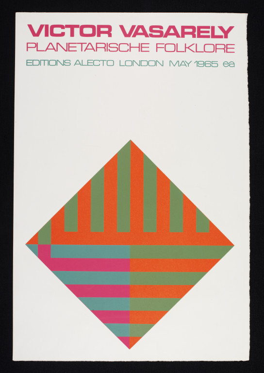
This is from the Illustrated London News, 19 August 1967.  The comment about the obscure nature of some of Kitaj’s literary references is part-justified, but this post focuses on a Mahler Suite print which links to the far from arcane oeuvre of William Shakespeare.

The print is entitled, Let Us Call It Arden/& Live in it! 1966.

Courtesy Tate Gallery

It’s likely that Kitaj was referring to Shakespeare’s As You Like It, one of the best known of his thirteen comedies.  The play reflects on the contrast between the way of life and manners as conducted in a city and the milieu of a natural environment, the latter being the Forest of Arden.  Shakespeare probably envisaged this on the basis of the Ardennes area of Belgium, (with some overspill into France and Luxembourg.)  Alternatively, some scholars have suggested he was thinking more locally – about the Forest of Arden which lay from Stratford-upon-Avon, Warwickshire to Tamworth, Staffordshire.

The notion is that in the city everything is very formulaic, regimented and bound by conventions, while life in the Forest is carefree, allowing people to ‘be’ and express themselves in a way reflective of their ‘true’ self.  At a simple level the print could be seen to straightforwardly express this concept, the lower portion filled with busy, disjointedly juxtaposed imagery, with the larger, upper area being quite Rothkoesque.  Study tends to return a contemplative (self-centred) experience from the blue/black/grey blocks.

Anticipating the current, apparently disproportionate concern with transgender ‘issues,’ As You Like It features a considerable measure of confusion, stemming from Rosalind disguising herself as a young male, Ganymede.  However, the object of her affection is Orlando, so as long as Rosalind remains ‘in drag’, there can be no overt romance.  Critics have suggested that Shakespeare was thus reflecting on the fact that city values, though diluted, still had ultimate authority and that the female will in the final analysis always be subordinate to the male.

It may be that Kitaj was simply showing support for the changing societal ethos of the Sixties, in effect advocating a culture in which general hippy values, gender equality, greater sexual freedom/openness and homosexuality flourished.

That’s just a start on evaluating this print and there’s more to ponder, e.g. what is the significance of the Swiss-context lower section imagery?  But aside from such considerations, this is another Kitaj print which repays sustained study and provides a very agreeable visual experience.

Op at Alecto

Whilst Editions Alecto will primarily be remembered for its association with Pop, Op too had a look-in.  For me Bridget Riley will always be supreme in this ‘style,’ but I do admire Victor Vasarely for his technical accomplishment and the great variety of subject forms he devised.  This poster is for a 1965 exhibition of screenprints by the Hungarian:

CIS:E.2227-1966

 Courtesy of Victoria and Albert Museum


Vasarely is an artist whose work could perhaps be underrated nowadays by younger people accustomed to computer-manipulated imagery.  Complex pattern creation and colour variation is today something that can be managed in software applications such as Photoshop with relative ease.  But consider the time and work involved for artists of the 60s seeking to draw and paint such images.  The patience and craft skills involved married to the conceptual vision required make for art which richly repays thoughtful contemplation.

Here he is exercising that patience and skill:

smups025

Courtesy of the Vasarely Archive, Chicago


Comparing Bridget and Victor I said in a previous post: . . . a Vasarely, though often captivating and arresting is more akin to a sugar rush.  Well, this print from the Planetary Folklore series, is sweet satisfaction of a lasting kind!:

Vasarely Planetary Folklore 1964

Courtesy of the Vasarely Archive, Chicago


Ah, 1965, that was a very good year

In my opinion there’s never enough Allen Jones on view, so just to be gratuitous, here is the 1965 print, ‘Self’:

allen-jones-self_medium

Courtesy of ModernPrints.co.uk

This is a screenprint, printed by Chiron Press, New York, and published by Tanglewood Press, L.A. Dimensions are 56 cms x 43 cms and the edition size, 225.

It’s a relatively early example of Jones’s focus on gender-blurring, (though predated by the ‘Concerning Marriages’ litho series), and use of a neck tie as a masculine-indicative image, (which was utilised centrally in the poster for the ‘Concerning Marriages’ exhibition at Editions Alecto, (November 1964)). The flat colour-filled diamond device is also seen in a painting from 1965, ‘Painted Screen’. Intriguingly, the illustration of this print in the definitive, Allen Jones Prints, compiled by Richard Lloyd, Prestel, Munich, 1995, is missing the lips motif, (presumably because of rendering in black/white).

Also from ’65, here’s a litho that I’ve always thought rather Kitaj-like, with a touch (!) of Hockney, ‘Miss America’:

allen-jones-miss-america_medium

Courtesy of ModernPrints.co.uk

This one is 61 cms x 50.5 cms and in an edition of 200, (but with no less than 50 A.P.s). It was published by Original Editions in a portfolio entitled, 11 Pop Artists. Jones’s prints relatively rarely incorporate photographic images of this type.

In recent times I’ve been able to indulge my Paolozzi devotion by drinking beer branded with his name and eating/drinking using crockery by Royal Doulton decorated with typical E.P. geometric patterning. I’m now pleased to discover that the Royal Academy is marketing these rather nice Allen Jones cups:

alan_jones_coffee_set

Courtesy of the Royal Academy of Arts

https://shop.royalacademy.org.uk/Allen-Jones/ltd-edt-set-of-coffee-cups.html

Dine Again (and again)

Although from Cincinnati, Ohio, Jim was an essential ‘component’ of the London scene in the late Sixties.  He lived here from 1967 to 1971.  His range of work at that time was very extensive and I was fascinated by his collage series, ‘Thorpe le Soken’, quirkily English and humorous; and prompting me to ask the ultimate question: just how long is a piece of string?  The ‘story’ around Dine was enhanced by his having work removed on the grounds of indecency in 1966  from the ultra-trendy Robert Fraser gallery.

The Toolbox print series was very much of the time – I previously posted examples in November 2014 – Here

Dine returned to this particular form of imagery time and again – just as he has done with other visual devices used and developed over the near 5 decades since the Sixties, for example: hearts; gowns and skulls.

This screenprint (Toolbox II) is from 1966:

jim_dine_tool_box_ii_1966

Sumptuous ‘Four Hearts’ is from 1969:

4-hearts

The Bathrobe’ is an etching from 1965:

bathrobe-etching

Moonstrips Empire News – introduction

The quality of Bob Dylan’s creativity and his productivity were outstanding in the mid-Sixties. The three LPs, Bringing It All Back Home, Highway 61 Revisited and Blonde on Blonde, ’65-’66, constitute his very best work. Compare Eduardo Paolozzi and his printmaking, ’64-’67: As Is When, Moonstrips Empire News and Universal Electronic Vacuum – masterworks all, embodying quality and quantity.

Moonstrips is a portfolio of 98 screenprints- 8 of which are signed/numbered – presented in a Perspex box. The prints are 380mm x 254mm. Additional sheets included in the box are a title page, colophon and introduction by Christopher Finch. Printing was by Kelpra Studio and the box was made by Herault Studios. The Portfolio was published in 1967 in an edition of 500 by Editions Alecto.

In As Is When Paolozzi invited the viewer to make both visual and linguistic connections, based on their own unique experience and knowledge, between many disparate component images and text. Here Paolozzi was developing the ideas of Marcel Duchamp, an early pioneer of shifting the balance of activity from the artist towards the viewer. Duchamp classified most art as being intended only to please the eye (‘retinal art’); his mission was to ‘put art back in the service of the mind’. In Moonstrips we can enjoy this latter objective being achieved whilst being fully indulged retinally at the same time.

ContentsLaidOut

In http://paolozzi.blogspot.co.uk  I look in great detail at the major Paolozzi series of the Sixties, including full coverage of Moonstrips Empire News.

Large Bus

Jones has said of the Bus images, “I did about five or six and then thought I was getting a bit locked into it and so wilfully stopped, although these days I wish I had another 10 in the cupboard”.

In the Fifties/Sixties buses were a living symbol of the times whereby the cosily familiar was co-existing with the exciting new era characterised by Harold Wilson’s phrase, ‘the white heat of technology’; (uttered at the 1963 Labour Party Conference at Scarborough.) In and around London a midpoint change on a journey might involve alighting from an RT bus, of which production had started just prior to World War II, and getting on one of the sexy new Routemasters. The contrast could be even more marked with single deckers – here below you have the ‘friendly’ old pre-War high roofed Bedford OB, left, and the futuristic Bedford Duple Viceroy of 1966, right:

 BusesCol

Large Bus is a stand-alone lithograph printed on two sheets, 72cms x 108cms and 30cms x 51.5cms, in an edition of 20; printed at Tamarind Litho Workshop, Los Angeles:

LargeBussmall


Real Glamour – the Allure of the Omnibus!

A Fleet of Buses was published by Editions Alecto in 1966/7. Printed by Kelpra Studio, it consists of a screen-printed title page and five lithographs, 64cms x 57cms, presented in a solander box. As for the New Perspective on Floors, the edition size was just 20.

The bus theme is first seen in Jones’s 1961 painting, You’ll Have to Run to Catch This Bus. The composition of this suggests a row of windows as typical in such a vehicle. Meanwhile there is a play on words around the physical idea of ‘catching’ a bus and the concept of the ‘prosumer’ spectator of an artwork, whereby both artist and viewer work together to derive ‘meaning’ from the marks on the canvas.

Subsequent paintings which lead progressively to the style of the lithographs are: 2nd Bus (1962), 4th Bus/Slow Red and Green (1962) and Buses (1964).

This is the pick of the lithographs:

d__images_P1969092226

Next post will be of the related, multi-sheet, Large Bus.

Colin Self

This should have been a print!  Had it been, I’d have a least two copies decorating rooms in my house.

Guard Dog on a Missile Base, No 1 (1965):

ColinSelfGuardDogOnAMissile

This one is a print, just! – etching, edition of 5 – Bomber No 1 (1963):

CS Bomber No 1

‘This was and is (remains) a terribly important little etching and IS the world’s first Multiple Plate etching.’ The insignia, from model-kit transfers, were added to subvert orthodox printing practice and, as they were different in each case, ‘not to blame any one Nation for the fearful state of the political world’.  The plates were found on a rubbish dump at University College; Self sawed one in half to make the wings.  Using popular art, ‘people’s art’, such as transfers or found components ‘waiting to be printed’, was an important part of the concept of this and other works of this date ,(and later).  (The Tate Gallery 1982-84: Illustrated Catalogue of Acquisitions, London 1986).

Back in the Sixties, it was a received wisdom that Hockney was a most marvellous draughtsman.  I believe that Colin Self was better – and his subject matter a whole lot more palatable!

Like many of his contemporaries, Self had a sojourn in the U.S. early in his career.  Unlike most, he was glad to get back to England and closely identified with his Norfolk surroundings.

A major series in the Sixties was the Power and Beauty set of screenprints.  Although the subject matter is quite different, the visual impact of these prints is to me similar to that created by Warhol’s Death and Disaster series; they are pretty sinister.  This is No 2 (1968):

CS P&B 2

Joe Tilson and the Ziggurats, (never released a single!)

Born in 1928, Tilson studied at St Martin’s and the Royal College of Art from 1949 to 1955.  At the RCA he won the Rome prize and the opportunity to live in Italy for 2 years.  On his return to England he began teaching in 1958, initially at St Martin’s.  Through the Sixties he was a major player on the Pop scene – in the British top three on my assessment: I’m not alone – The Daily Telegraph headlined an April 2009 article thus: Joe Tilson: the forgotten king of British Pop art. That piece included the following passage:

“In the Sixties, I thought the question, ‘What is an original print?’ was totally irrelevant,” Tilson recalls. “My aim was to make things that corresponded to my feelings and thoughts – not to pre-established categories.” He made a list of things you were not supposed to do in printmaking: “Make each print different; paint on prints; tear the paper; crumple and fold the paper; make holes in the print; make three-dimensional prints; glue objects to the print…”, and so on. One by one, he broke each rule.

I’m featuring here two examples from the screenprint series, Ziggurat, based on a run of wood reliefs.  As we have seen with several Sixties artists, Tilson’s optimum creativity was unleashed by collaboration with the magnificent Chris Prater at Kelpra Studio, beginning in 1961.  A variety of ziggurats emerged from Tilson’s studio from 1964 through to 1970.  These are simple, high impact images, a great pleasure just to view and have around the place.  Subsequently I will also showcase more conceptually complex Tilsons, in which there are similarities with Paolozzi and Kitaj – no wonder I like these too, very much!

Pat Gilmour in referring to the ‘sister’ series, Geometry, commented about Tilson’s artistic practice where there was a:

. . . close relationship between ideas in sculpture and in the printed work and the way both were able to feed each other.  (This) is typical of the artists who were able to take the screen process furthest.  By the time the brouhaha broke out over the ‘originality’ question in 1965, Tilson had moved into an area he was to make very much his own, fashioning three-dimensional prints.

1/2 Ziggurat:

1 2 Zigguratcropped

Ziggurat 6:

Ziggurat 6cropped